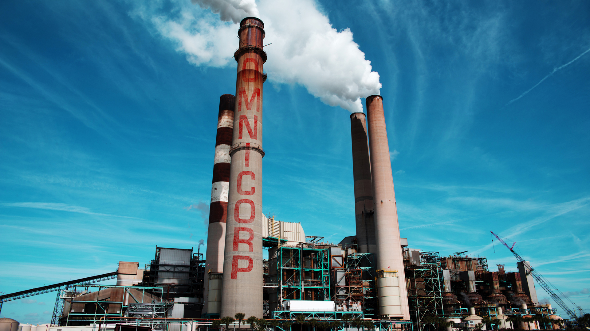
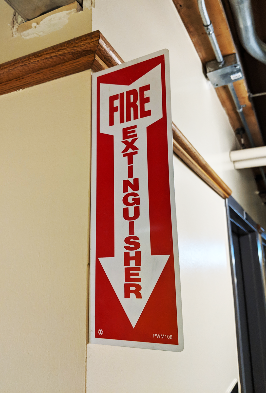
MAXIMUM is the result of a designer’s obsession to create a typeface for vertical applications.

Inspiration
The process began with extensive research into typefaces used for vertical stacking. Bungee, a typeface designed by David Jonathan Ross, explored the topic at great length. However, it sought to recreate a niche retro aesthetic.
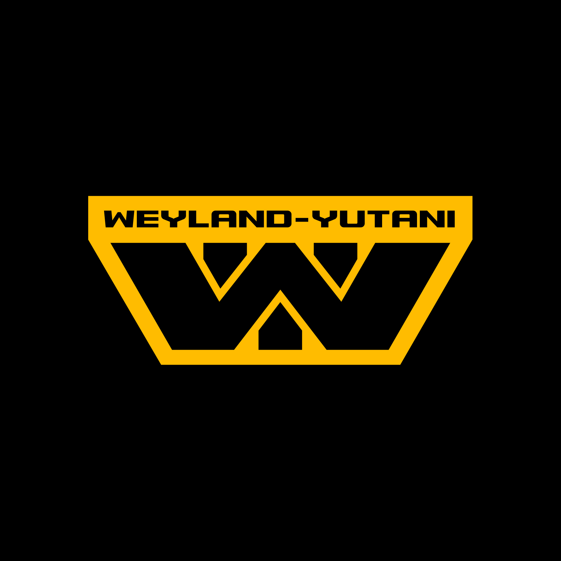
Eurostile is often used in vertical applications, but the results are dependent on the designer’s ability to tweak the typeface to their needs. But the industrial feel makes it desirable to vertically stack.

Prime Directive
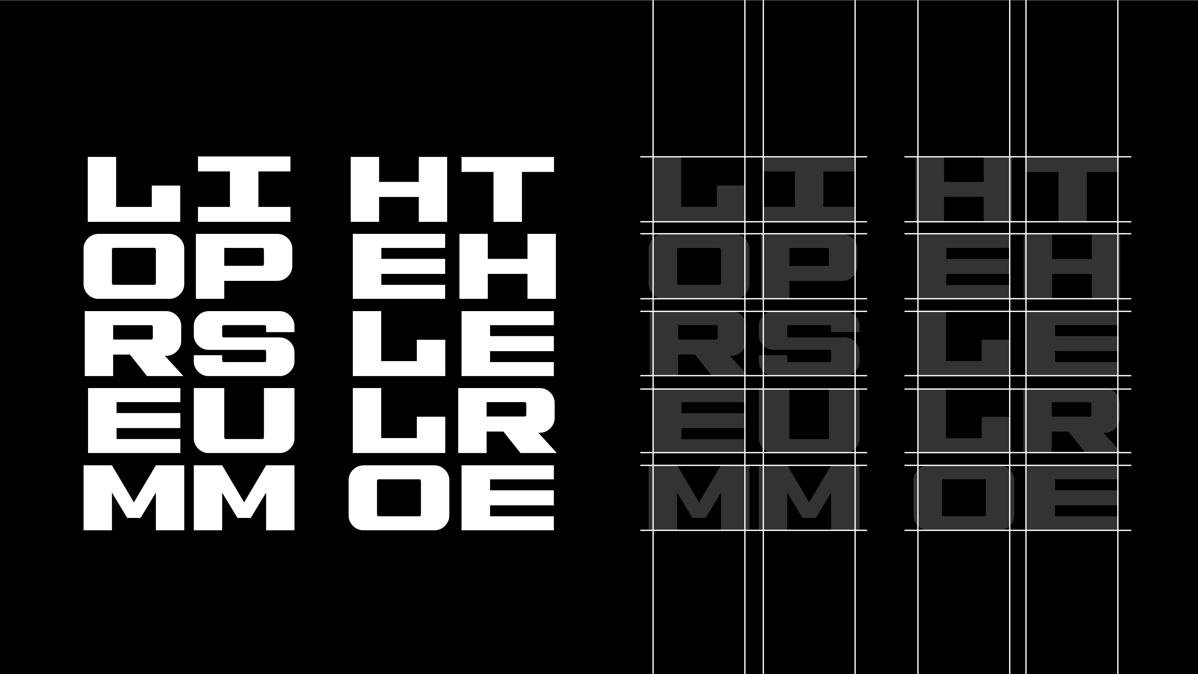
The primary goal of Maximum is to be a vertically stacking typeface that has the same structure as Bungee, but with similar aesthetics to that of Eurostile.
With a vertical grid in mind, geometric forms were drawn with minimal curvature. This allows the typeface to retain a rigid structure while improving the vertical flow.
Optical Balance
To aliviate issues with relationships between wide and thin characters, the grid features three widths: Small, Regular, and Large. The subtle variations in width are unnoticable and helps balance the characters when stacked.
This method of optical balance is adapted directly from Bungee, as it was built with similar tweaks to ensure the optimal appearance.

Two Widths
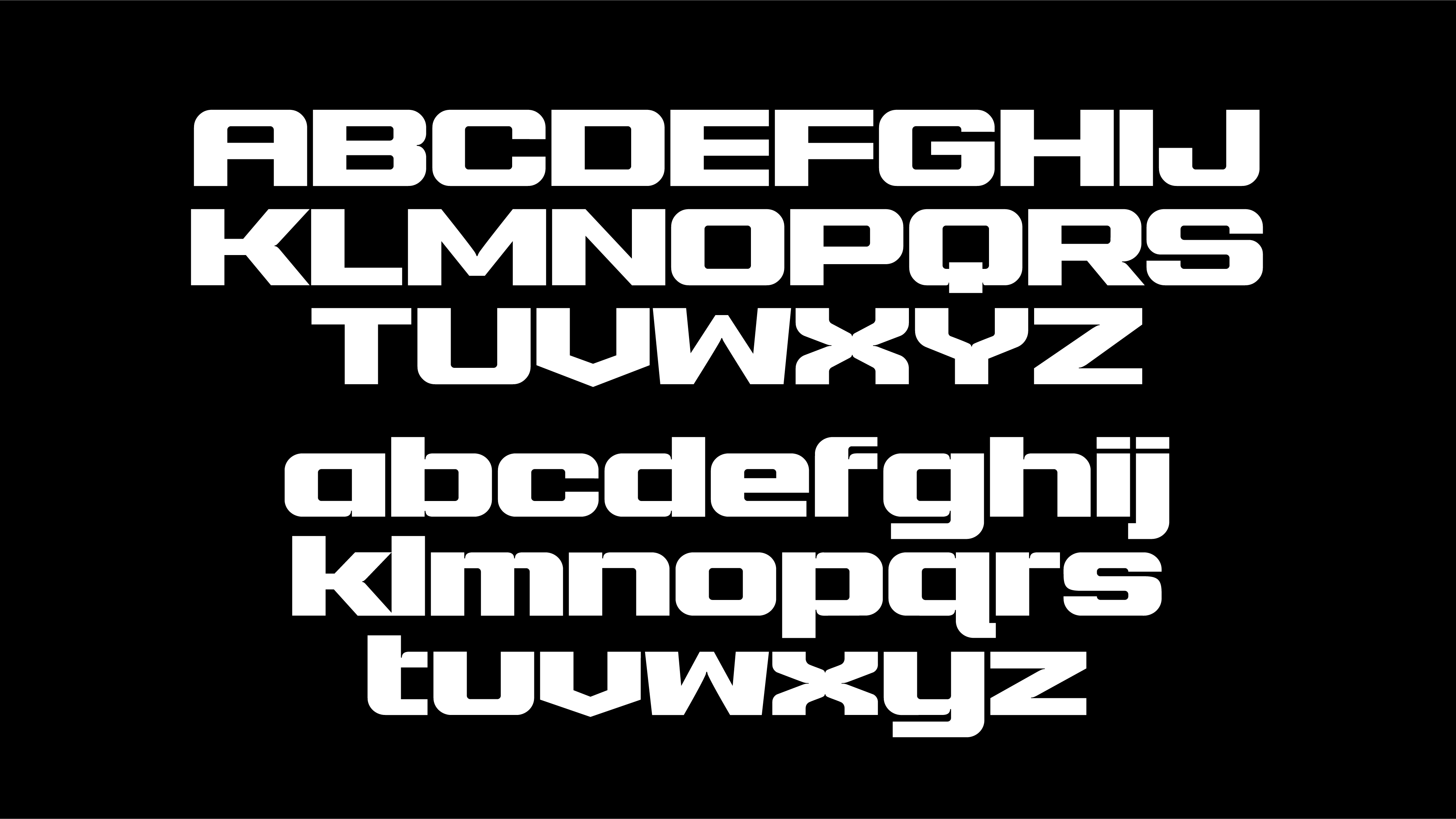
Instead of creating a set of lowercase letters forced into the grid, a thinner version of the uppercase are available. While they share the same height, they have significantly smaller widths.
To use the thinner characters, all you have to do is type in lowercase. This makes it easy to switch between the two by simply changing the case.

Regular Version
To round out Maximum, a Regular version was created in addition to the Stacked. It contains less optimization for stacking but a more complete character set and includes lowercase characters.
Inktraps are exaggerated and prominently featured. It helps give definition while retaining the industrial aspects of the Stacked.

 Maximum
 Eurostile
 Original
 Maximum