Manitoba EcoNetwork
Branding / Web
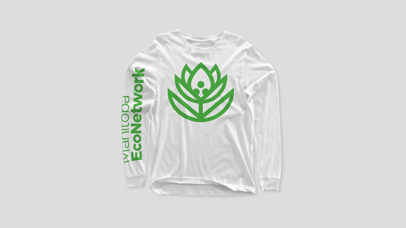
The Manitoba EcoNetwork is a non-profit organization dedicated to promoting and facilitating positive environmental action. They facilitate four main programs — Climate Change Connection, Water Caucus, Manitoba Environmental Youth Network, and Organic Lawn Care. A focus of the hypothetical rebrand is to bring legitimacy to the organization through consistent communication. The new logo and wordmark improves upon previous branding by reducing the number of elements and increasing legibility.

The Prairie Crocus
The Provincial Flower of Manitoba. In recent decades, prairies have been replaced with farms, roads, and cities, leaving the prairie crocus increasingly more uncommon. But they grow in small, concentrated areas, acting as beacons of hope that their habitat will eventually return to its former glory.
The EcoNetwork seeks to restore balance in the environment. The prairie crocus is a perfect fit as the logo for the organization, and provides a symbol that they can rally behind.


The EcoJournal
The EcoJournal is a quarterly published newsletter that is created by the EcoNetwork to showcase events, news, and important stories regarding the environment. To bring the print piece into the modern era, as well as reduce its impact, the journal changes to a regularly updated blog.
Inspired by Low Tech Magazine’s switch to a solar powered server, the new EcoJournal will feature bitmap images, a simple type layout, and minimal resizing at different viewports. This allows for faster load times and minimal use of server space, decreasing the overall impact.